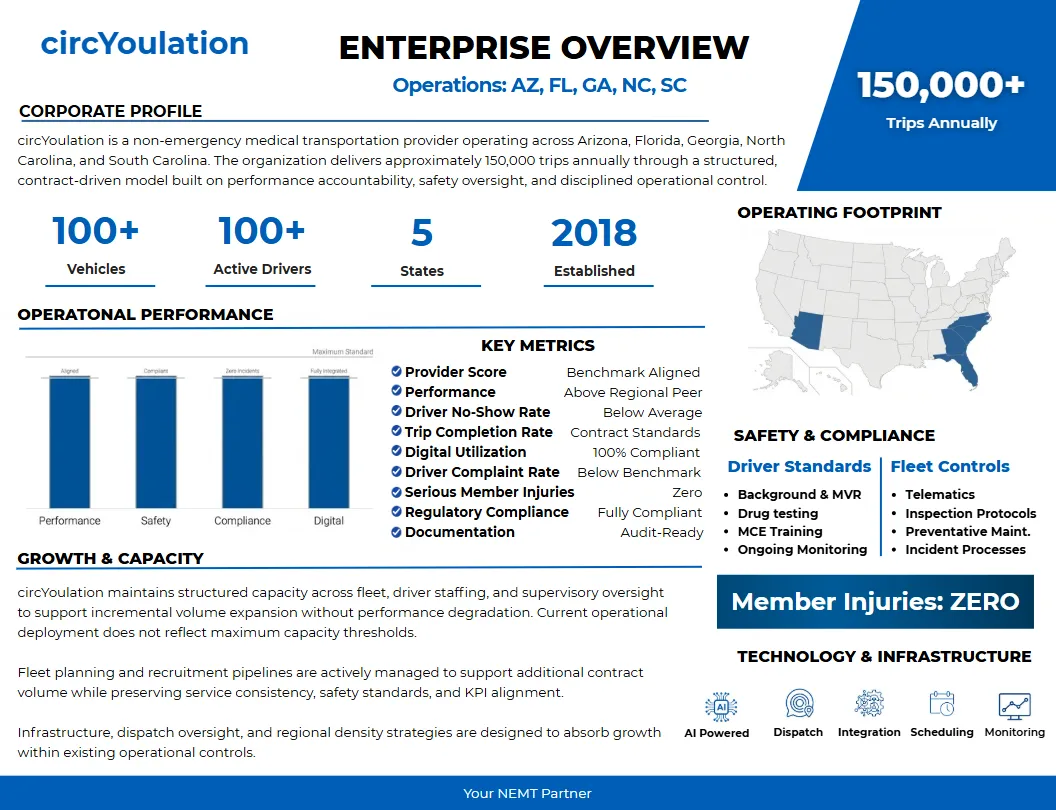
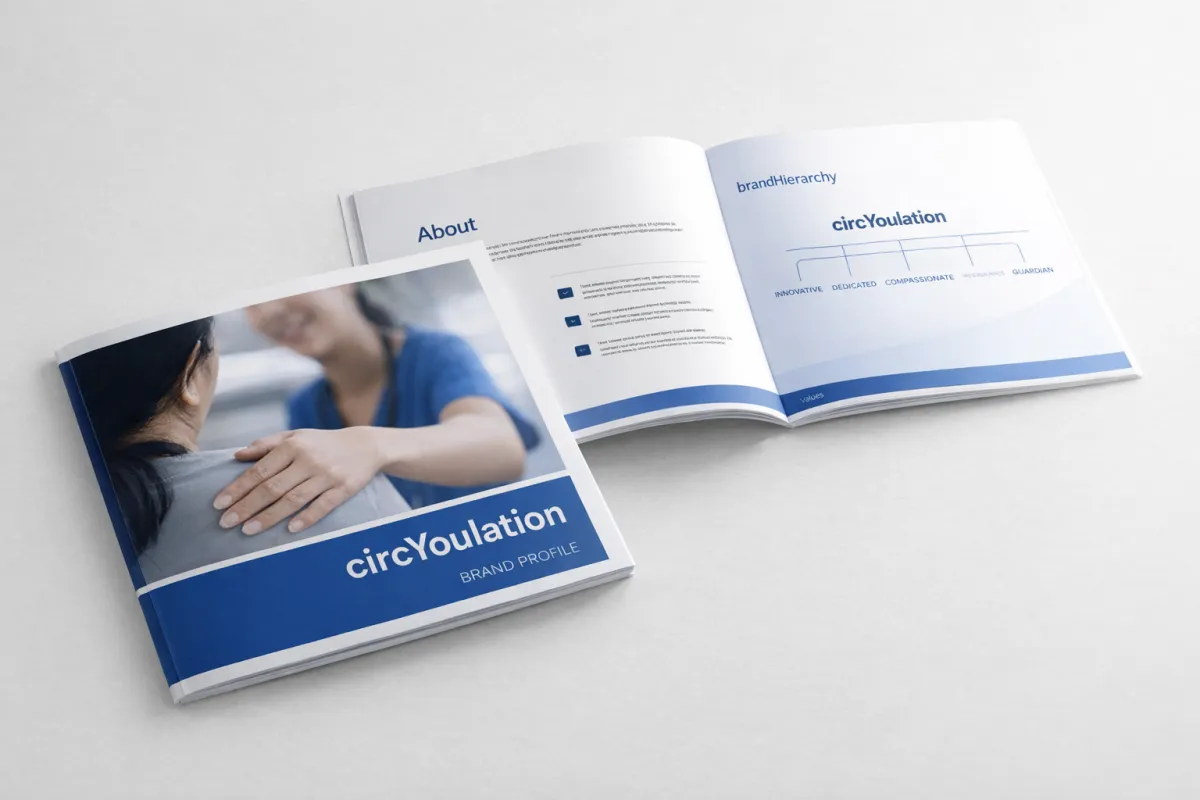
circYoulation Brand Profile
Porcshe - Duke

Icons, Symbols and Text

HIPPA Compliant
Lorem Ipsum is simply dummy text of the printing and typesetting industry.

Secure Cloud Data
Lorem Ipsum is simply dummy text of the printing and typesetting industry.

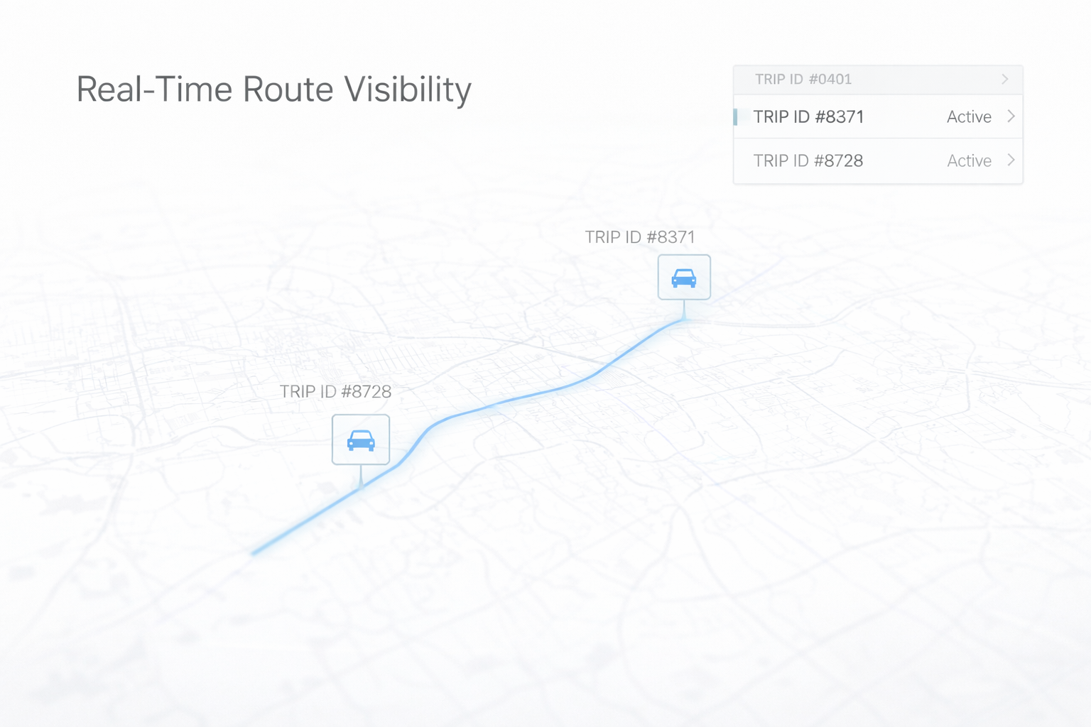
Trip Optimazation
Lorem Ipsum is simply dummy text of the printing and typesetting industry.
Operations


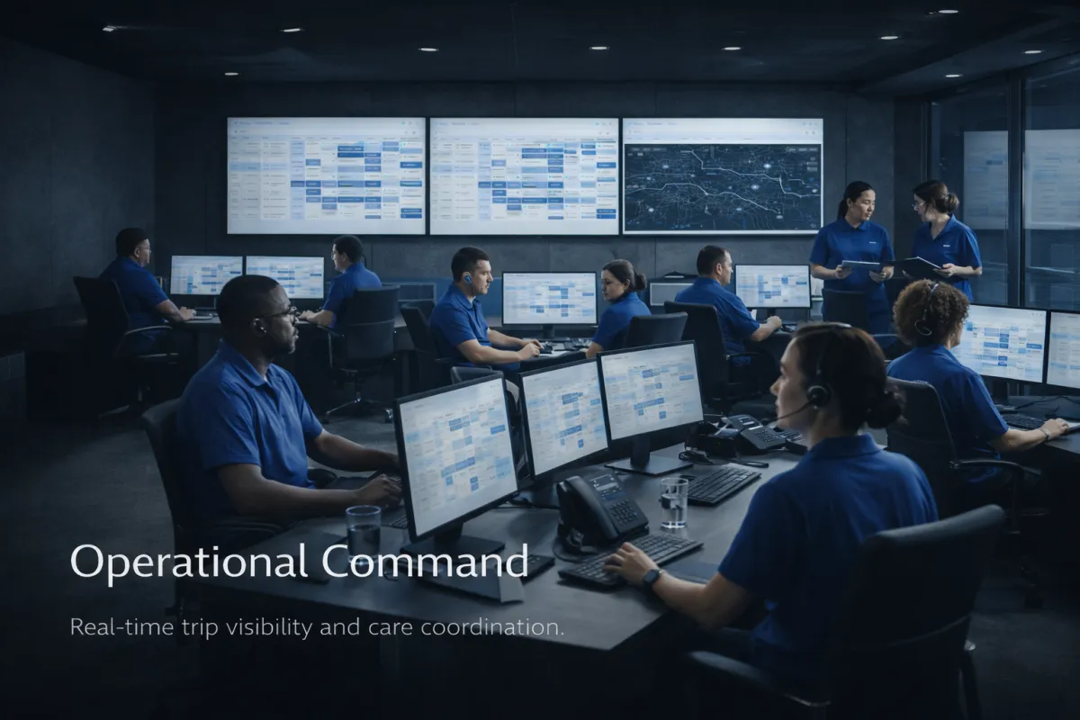


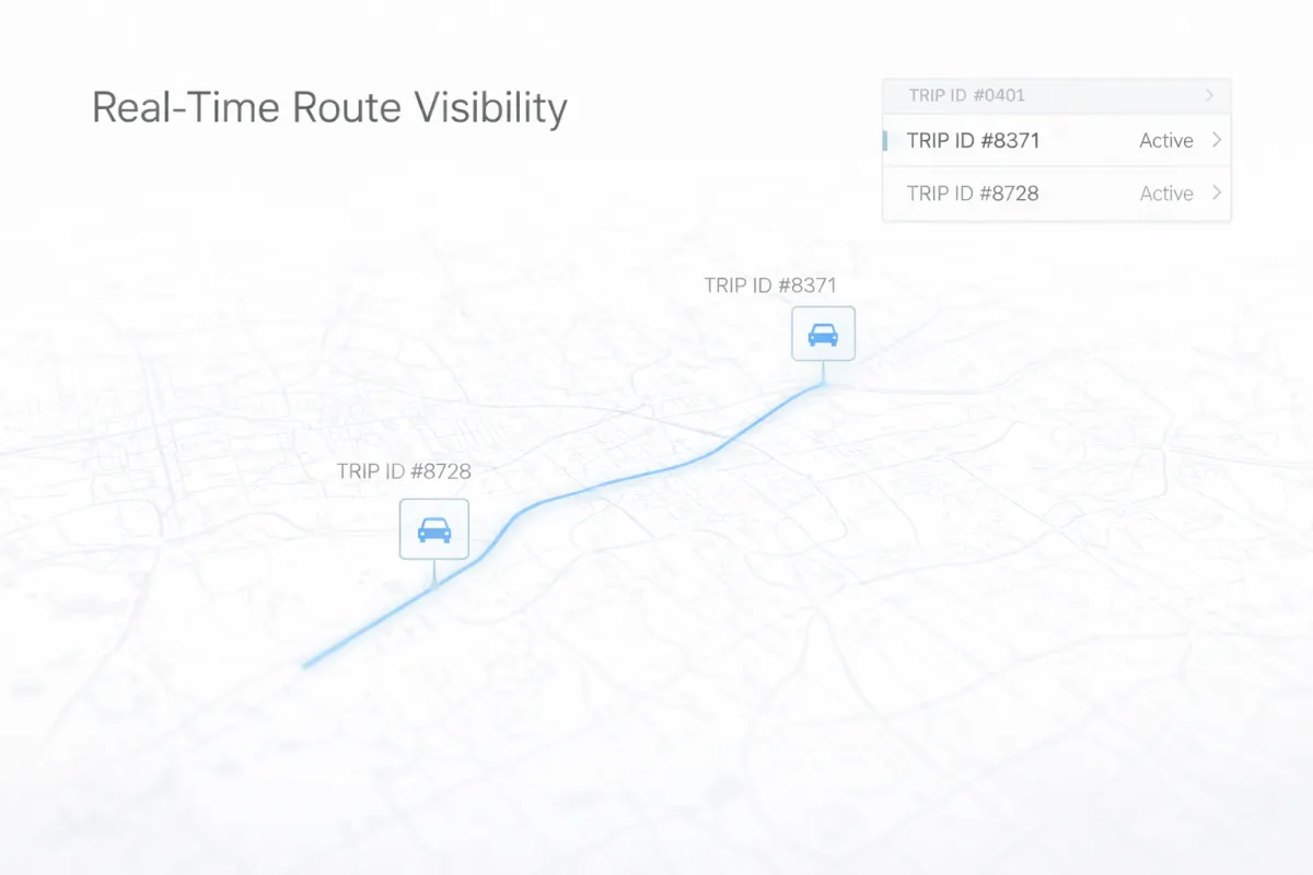
This highlights circYoulation’s advanced visibility and control—ensuring on-time performance, operational efficiency, and reliable non-emergency medical transportation for every patient.


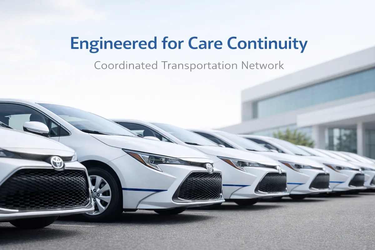
Every detail showcases professionalism, from branded blue uniforms and secure ID badges to clearly marked Toyota Corolla fleet vehicles.
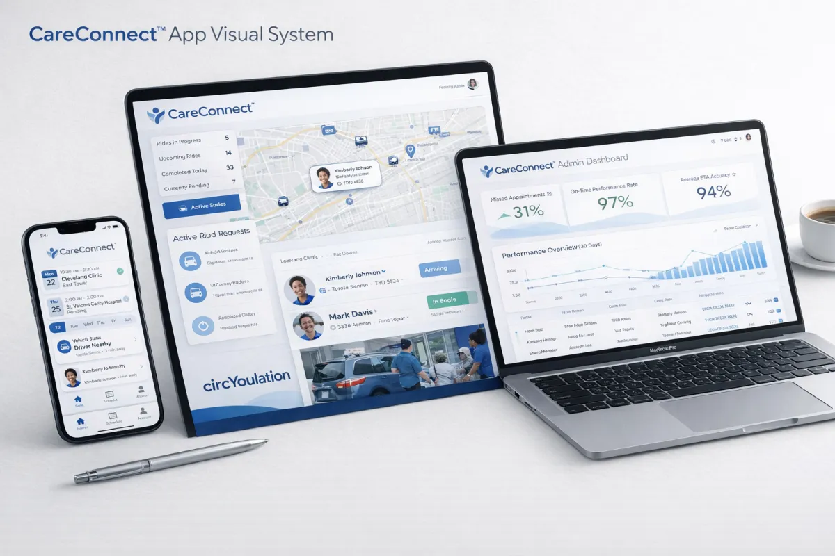
A modern, integrated healthcare transportation platform displayed across mobile, tablet, and desktop devices. CareConnect™ – Smarter, Seamless Healthcare Transportation
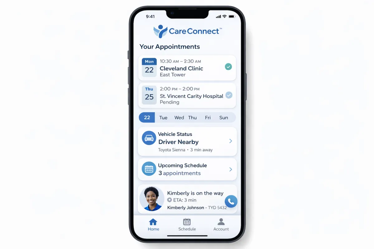
CareConnect™ mobile platform, designed to simplify and streamline medical transportation coordination. The intuitive app lets users view appointments, track drivers in real time, receive live ETAs, and manage schedules, all in one secure, easy-to-use dashboard.
Blending professional design with compassionate healthcare imagery, it reinforces our commitment to innovation, reliability, and patient-centered service—positioning circYoulation as a trusted leader in non-emergency medical transportation.
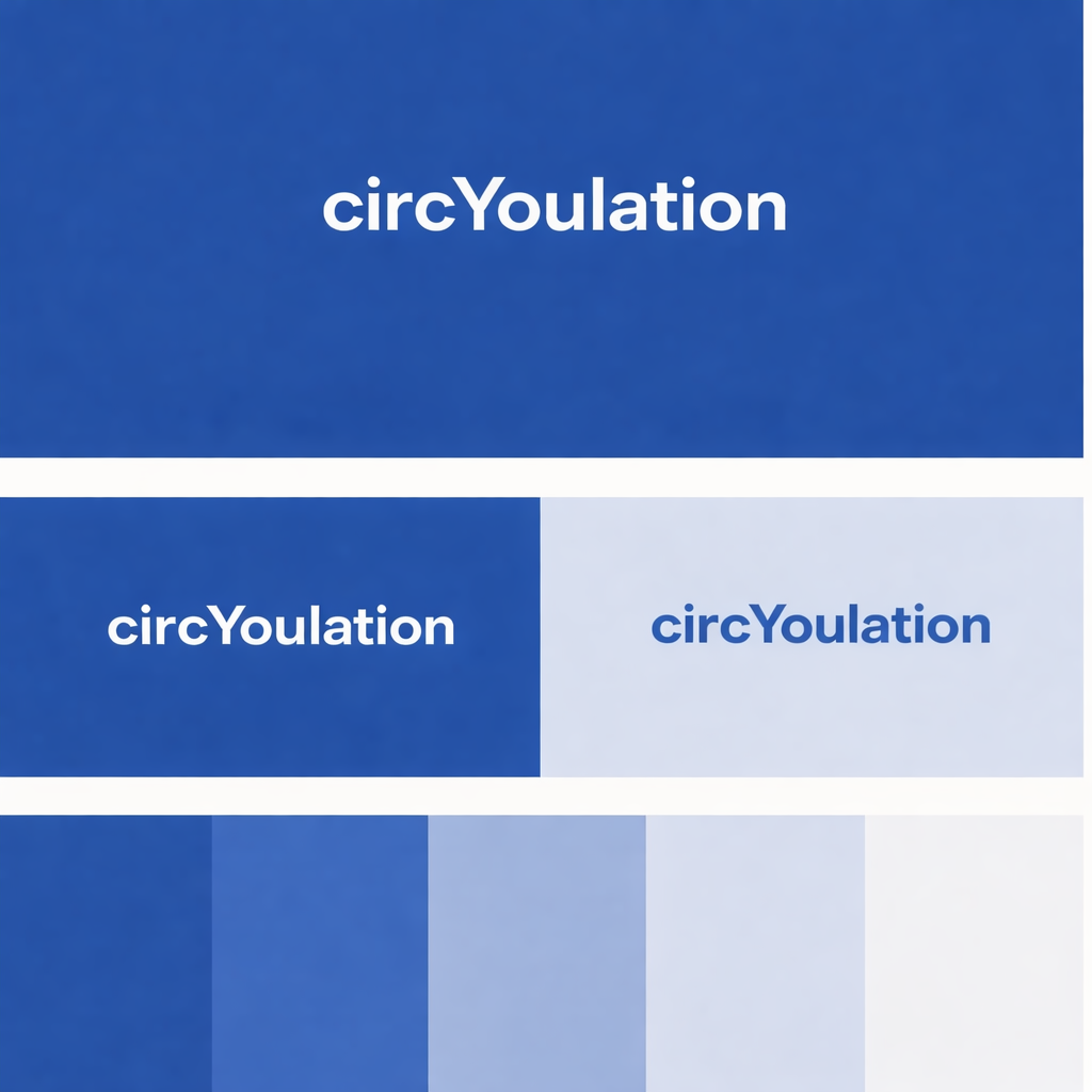
NEW BLUE
HEX #005EB8
circYoulation's new Blue is a color long associated with trust, calm, and reliability—key attributes in healthcare environments. It signals stability and professionalism, helping patients and partners feel secure. When our audience—healthcare providers, patients, and partners—sees a professional blue, it subconsciously reinforces that we are trustworthy, capable, and aligned with the clinical world. We chose this blue because it elevates our identity from transportation into an extension of healthcare—an authority that partners can rely on.
HIPPA Trained and Certified
Our team holds certifications


Ready to connect the dots with CareConnect™?
When we say that premium-level branding avoids literal explanations, the goal is not to remove clarity. The goal is to remove visual metaphors that weaken authority. There is a significant difference between eliminating symbolic graphics and eliminating operational transparency. Healthcare executives, hospital administrators, and physician groups do not respond well to decorative metaphors such as pushpins, puzzle pieces, glowing network webs, or overly sentimental imagery. Those elements feel promotional and vendor-oriented. What they respond to is visual discipline that communicates competence, stability, and institutional maturity.
Healthcare buyers evaluate risk before they evaluate aesthetics.
Subconsciously, they are asking:
Does this company look operationally disciplined
Does this company understand healthcare workflows
Does this company appear integrated into systems rather than external to them
Does this company reduce liability and protect revenue
Structured, restrained design answers those questions more effectively than symbolic illustrations. Clean white space, controlled typography, disciplined color usage, and composed imagery signal maturity. Maturity signals reliability.
However, restraint must not become abstraction. Healthcare decision-makers still require proof. They expect visible evidence of capability, including:
• Real-time route visibility
• Structured dispatch environments
• Engineered child safety systems
• Fleet organization and consistency
• Clear workflow alignment
The shift is from metaphor to infrastructure. Instead of explaining “connection” with symbolic objects, we demonstrate route oversight. Instead of showing partnership through puzzle pieces, we show process integration. Instead of emotional hand-holding imagery, we show dignified assistance and professional composure.
Healthcare executives focus on four institutional priorities:
• Risk mitigation
• Revenue protection
• Operational reliability
• Continuity of care
If the visual language reflects discipline, system thinking, and control, it aligns with these priorities. If it appears decorative or promotional, it reduces credibility.
The correct balance is structured restraint combined with operational clarity. The formula becomes:
• Institutional tone
• Healthcare alignment
• Evidence-based visuals
Minimal design does not mean vague communication. It means intentional communication. Every visual and typographic decision must support measurable outcomes and system integration. The presentation should never feel ornamental. It should feel engineered.
The real question is not whether executives “like” the design. The real question is whether the design makes the organization appear embedded within healthcare operations rather than positioned as an external transportation vendor. If the visual language communicates integration, stability, and process maturity, it succeeds. If it feels like transportation marketing rebranded in healthcare colors, it fails.
The objective is not trend-based refinement. The objective is institutional credibility. That is what hospital systems and physician groups ultimately trust.
Ready to connect the dots with CareConnect™?

When we say that premium-level branding avoids literal explanations, the goal is not to remove clarity. The goal is to remove visual metaphors that weaken authority. There is a significant difference between eliminating symbolic graphics and eliminating operational transparency.
Healthcare executives, hospital administrators, and physician groups do not respond well to decorative metaphors such as pushpins, puzzle pieces, glowing network webs, or overly sentimental imagery. Those elements feel promotional and vendor-oriented. What they respond to is visual discipline that communicates competence, stability, and institutional maturity.
Healthcare buyers evaluate risk before they evaluate aesthetics.
Subconsciously, they are asking:
Does this company look operationally disciplined
Does this company understand healthcare workflows
Does this company appear integrated into systems rather than external to them
Does this company reduce liability and protect revenue

Structured, restrained design answers those questions more effectively than symbolic illustrations. Clean white space, controlled typography, disciplined color usage, and composed imagery signal maturity. Maturity signals reliability.
However, restraint must not become abstraction. Healthcare decision-makers still require proof.
They expect visible evidence of capability, including:
Real-time route visibility
Structured dispatch environments
Engineered child safety systems
Fleet organization and consistency
Clear workflow alignment
Subconsciously, they are asking:
Does this company look operationally disciplined
Does this company understand healthcare workflows
Does this company appear integrated into systems rather than external to them
Does this company reduce liability and protect revenue
They expect visible evidence of capability, including:
Real-time route visibility
Structured dispatch environments
Engineered child safety systems
Fleet organization and consistency
Clear workflow alignment
The shift is from metaphor to infrastructure. Instead of explaining “connection” with symbolic objects, we demonstrate route oversight. Instead of showing partnership through puzzle pieces, we show process integration. Instead of emotional hand-holding imagery, we show dignified assistance and professional composure.
Healthcare executives focus on four institutional priorities:
Risk mitigation
Revenue protection
Operational reliability
Continuity of care
Healthcare executives focus on four institutional priorities:
Risk mitigation
Revenue protection
Operational reliability
Continuity of care
If the visual language reflects discipline, system thinking, and control, it aligns with these priorities. If it appears decorative or promotional, it reduces credibility.
The correct balance is structured restraint combined with operational clarity. The formula becomes:
Institutional tone
Healthcare alignment
Evidence-based visuals
The correct balance is structured restraint combined with operational clarity. The formula becomes:
Institutional tone
Healthcare alignment
Evidence-based visuals
Minimal design does not mean vague communication. It means intentional communication. Every visual and typographic decision must support measurable outcomes and system integration. The presentation should never feel ornamental. It should feel engineered.
The real question is not whether executives “like” the design. The real question is whether the design makes the organization appear embedded within healthcare operations rather than positioned as an external transportation vendor. If the visual language communicates integration, stability, and process maturity, it succeeds. If it feels like transportation marketing rebranded in healthcare colors, it fails.
The objective is not trend-based refinement. The objective is institutional credibility. That is what hospital systems and physician groups ultimately trust.
circYoulation
YOUR NEMT PARTNER
YOUR NEMT PARTNER